Lucanet
Jobsite
Career Page
Job Searching:
Simple & Easy
Lucanet, a leading financial management software "Saas" company in Berlin, commissioned us to build their new career website to draw younger and more talented applicants. With the redesign, the website shows a clearer company vision with tangible employees' stories. The website aims to go against a generic, cold tech vibe.
Duration: April 2022 - Nov 2022
Credit
This website was finished at RCKT.
Big thanks to
UX writer: Sarah Liewehr
Consultant: Simon Jochum
Dev team: Galo
Role
As a single UX/UI designer for this project, I led the whole team together with the agency consultant. Starting from the new corporate branding, I established a scalable and systematic UX/UI design solution for the career page that could also be applied to the main corporate page. I took great ownership of the project, participating in art direction for images, motion design, micro interaction, and product development management such as Jira boards and workflow creation and maintenance with developers. I made sure the new website catch users' attention and give a premium workplace vibe for them to choose.
The Initial Problems
1. Generic, Stereotypical tech look & lack of digital branding
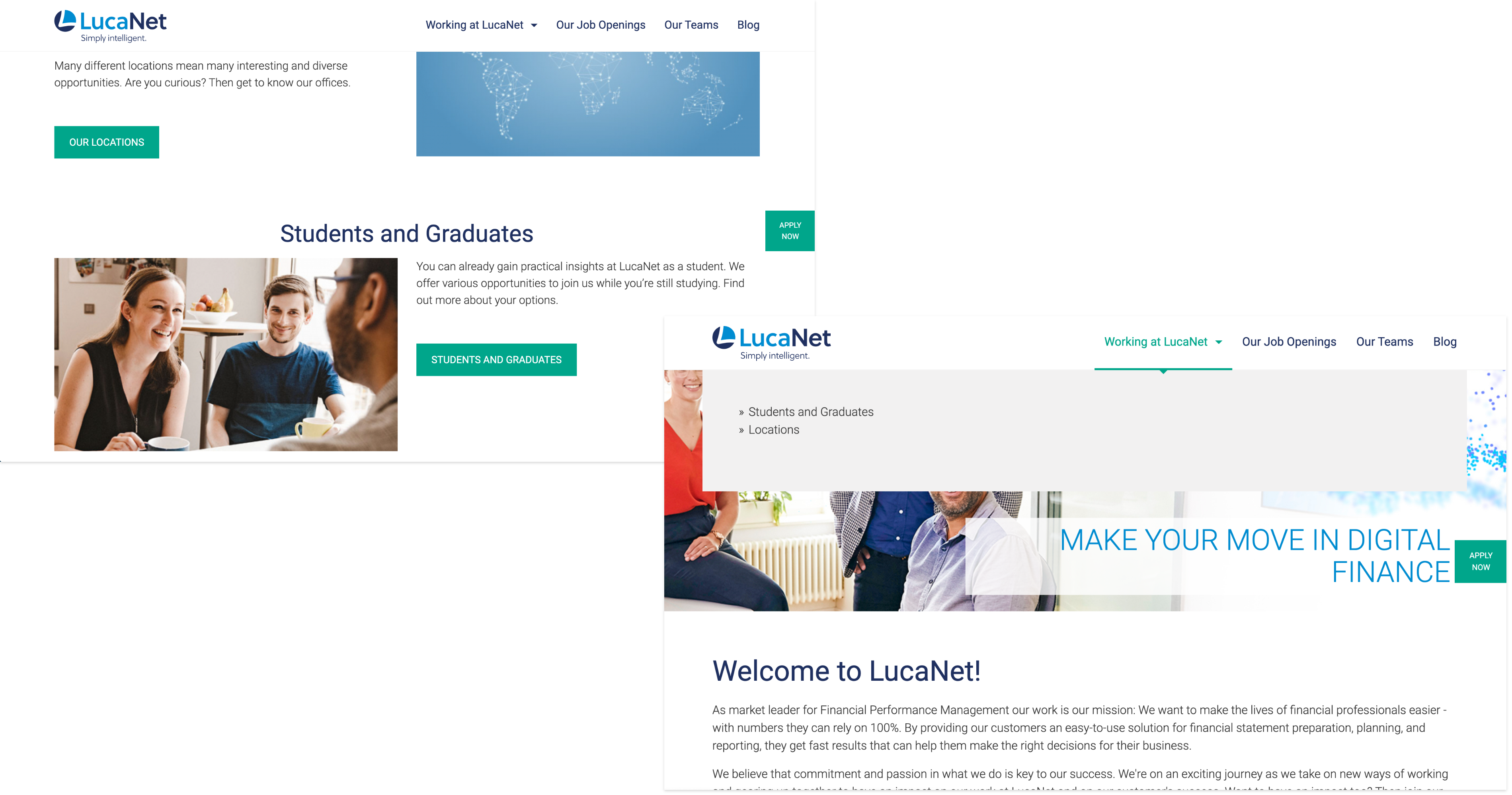
The old Lucanet website didn't convey the company's modern and inclusive environment. The website used a lot of stock images that downgrade the company's values. To sum up, the website needed a new fresh look with real images, a modern brand, and tangible employee storytelling.
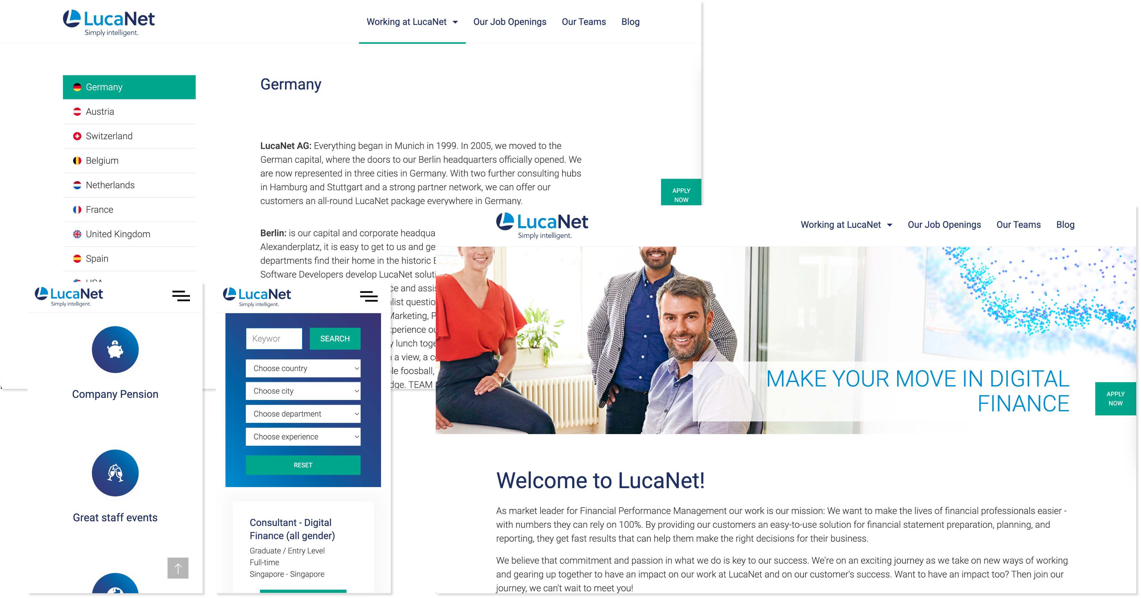
Old Lucanet website
2. Users are not interacting with the website
After reviewing the website's analytic, we found out that users didn't spend more than just couple minutes within the old website. This means that the current website failed to capture the attention of potential applicants.
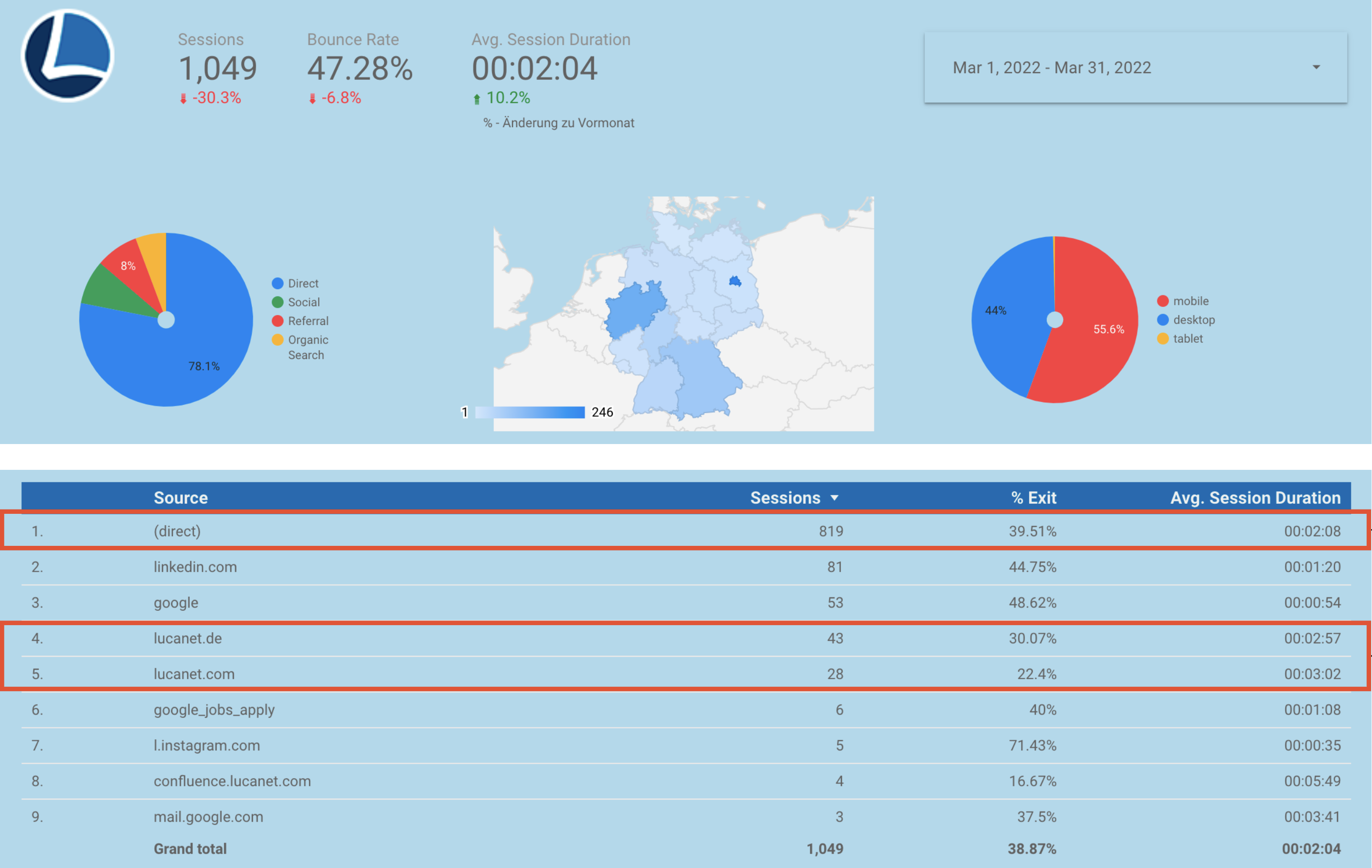
Old Lucanet website Google Analytics
3. Unclear user journey with the poor information architecture
We heuristically summarized the reasons:
1. Too many unnecessary buttons distracting users to apply for jobs
2. Confusing menu navigation and the company's values structure
3. Unclear UX writing for most links and CTAs
Too many buttons and unclear UX writing / structure for old Lucanet menu
Achievements
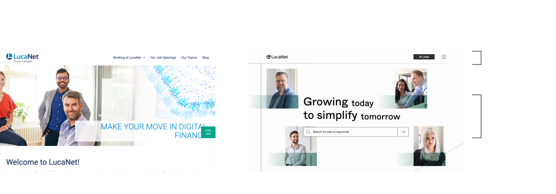
1. Smoother Job searching & application experience
2. Deliver authentic & emotional employees stories
3. New responsive, interactive, and sustainable design system
4. Effective workflow for building modules & Dev comms
5. Increased page views and duration after the relaunch
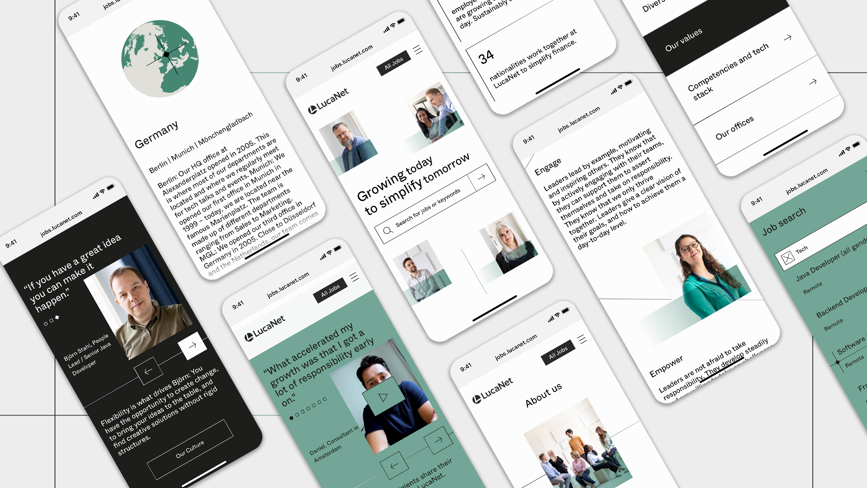
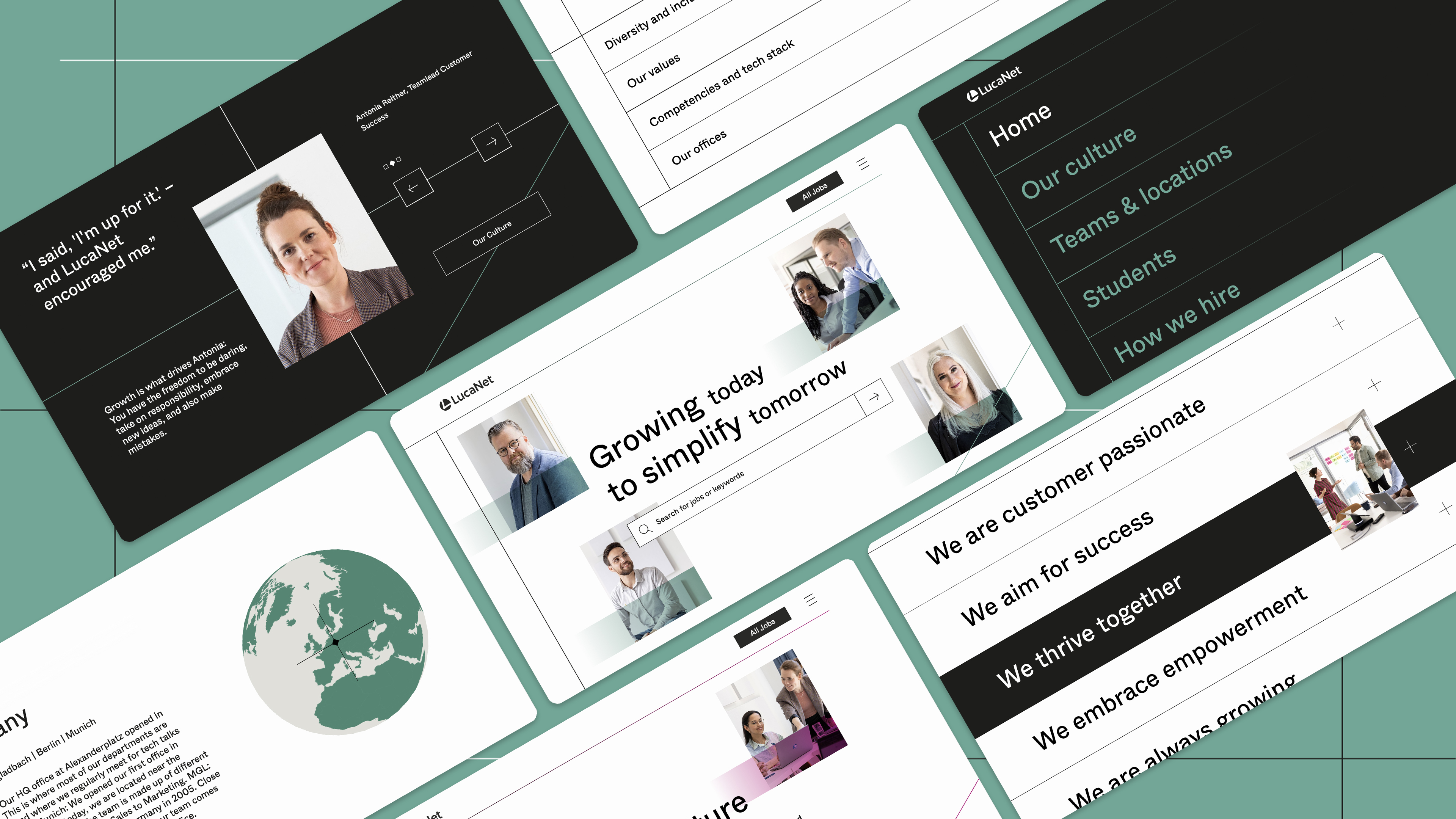
Homepage job searching (Mobile)
Comparison
Before and after the desktop landing page
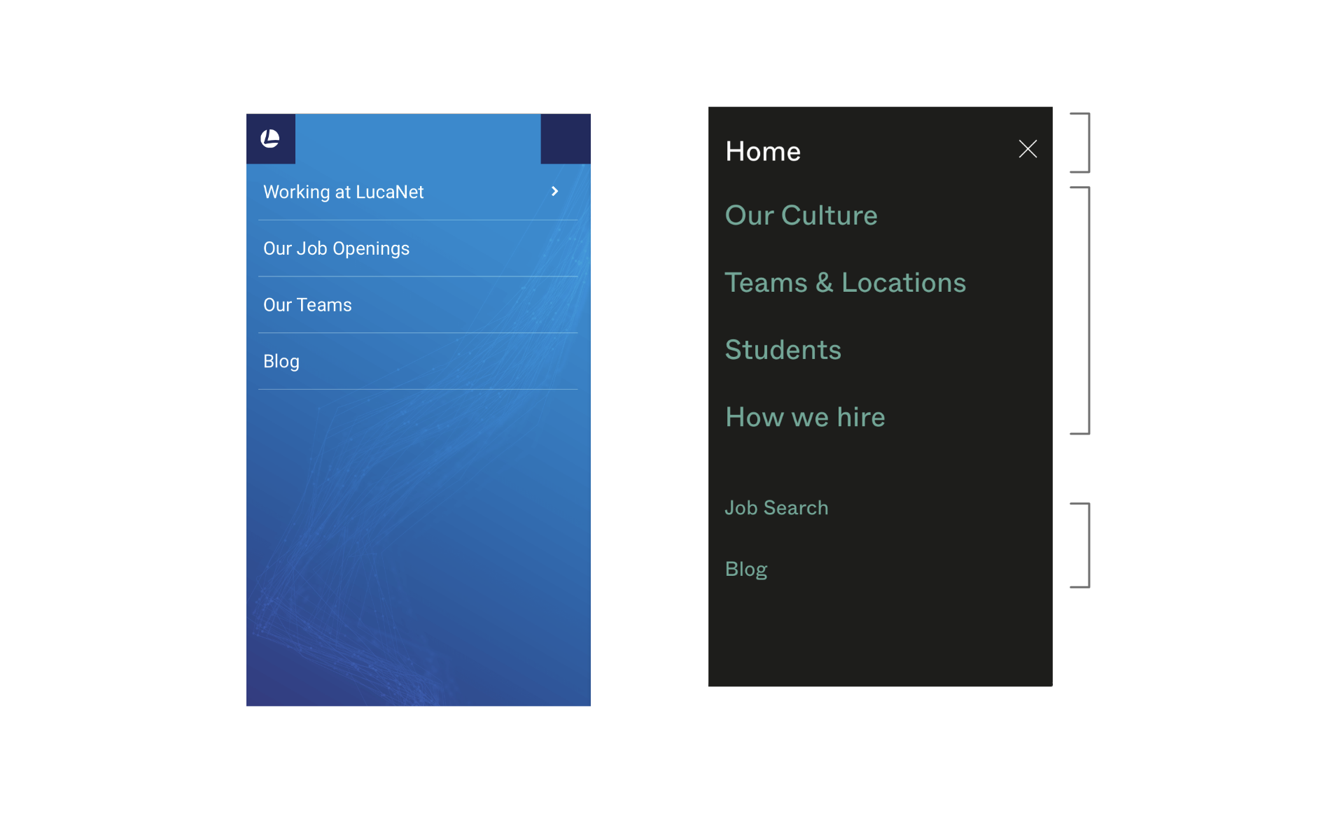
Before and after the menu mobile
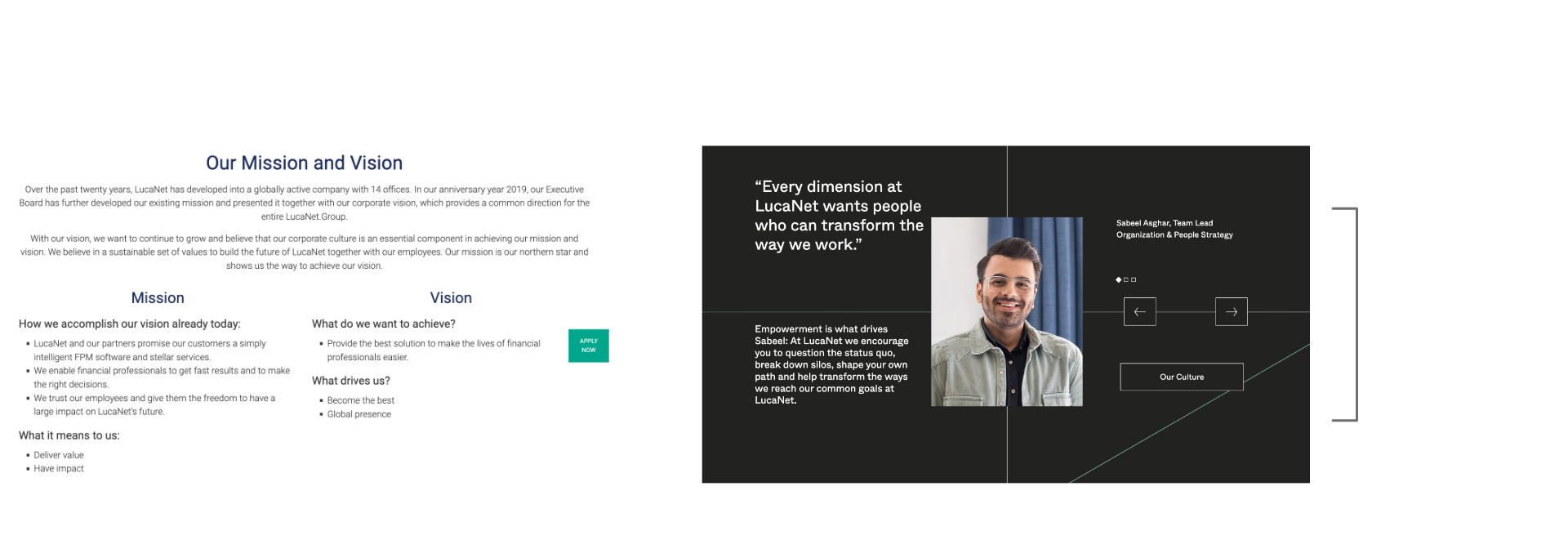
Before and after the desktop mission and vision
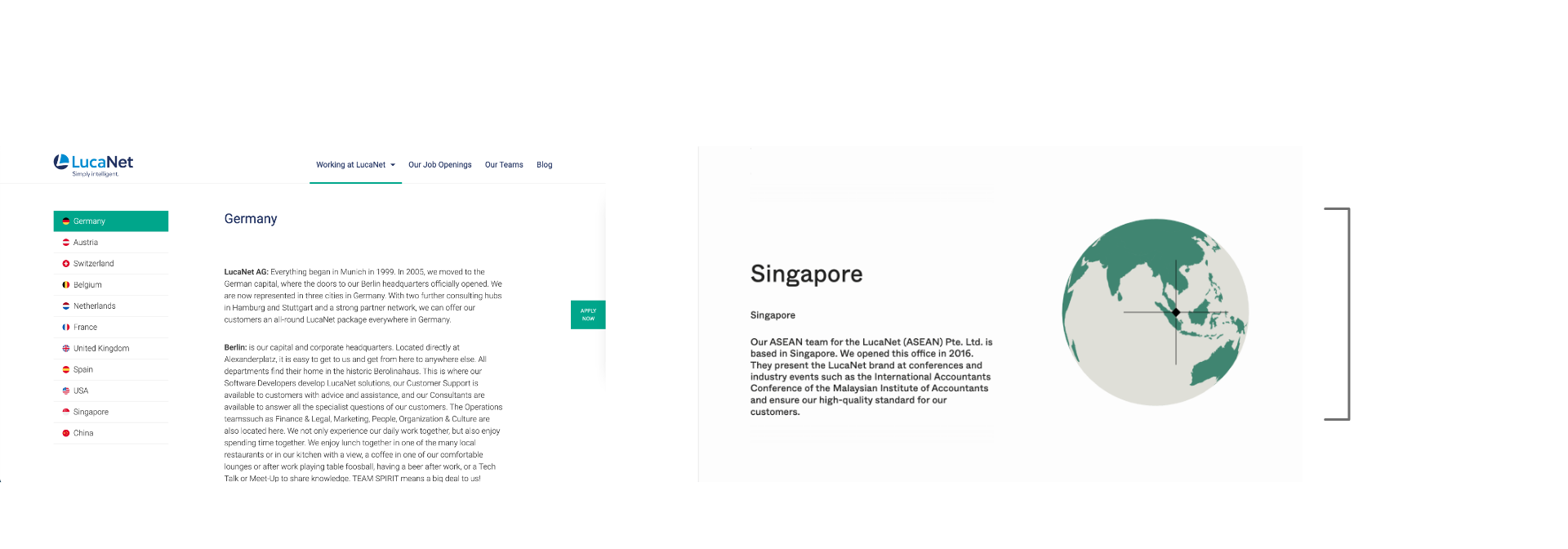
Before and after the desktop locations
Understanding the users
The client targets the potential users / applicants such as:
We want to reach talent with a strong digital, growth and/or activist mindset. People who are analytical and yet creative problem solvers with a deep passion for technology.
Our target group are high performers with a clear goal in mind. Their entrepreneurial spirit drives them and others. Purpose-driven at heart, they focus on the why and actively shape and celebrate the team’s culture.
Benchmarks
Before going directly to design, we wanted to see the successful corporate career pages and their website journey.
We found they have these features:
1. Evergreen Button for the "All Jobs" Page
2. Homepage adapts the search tool first
3. Powerful Job search functions and category filters
4. Gradual information deliveries, not overwhelming users
5. Interactive and authentic content such as personal videos
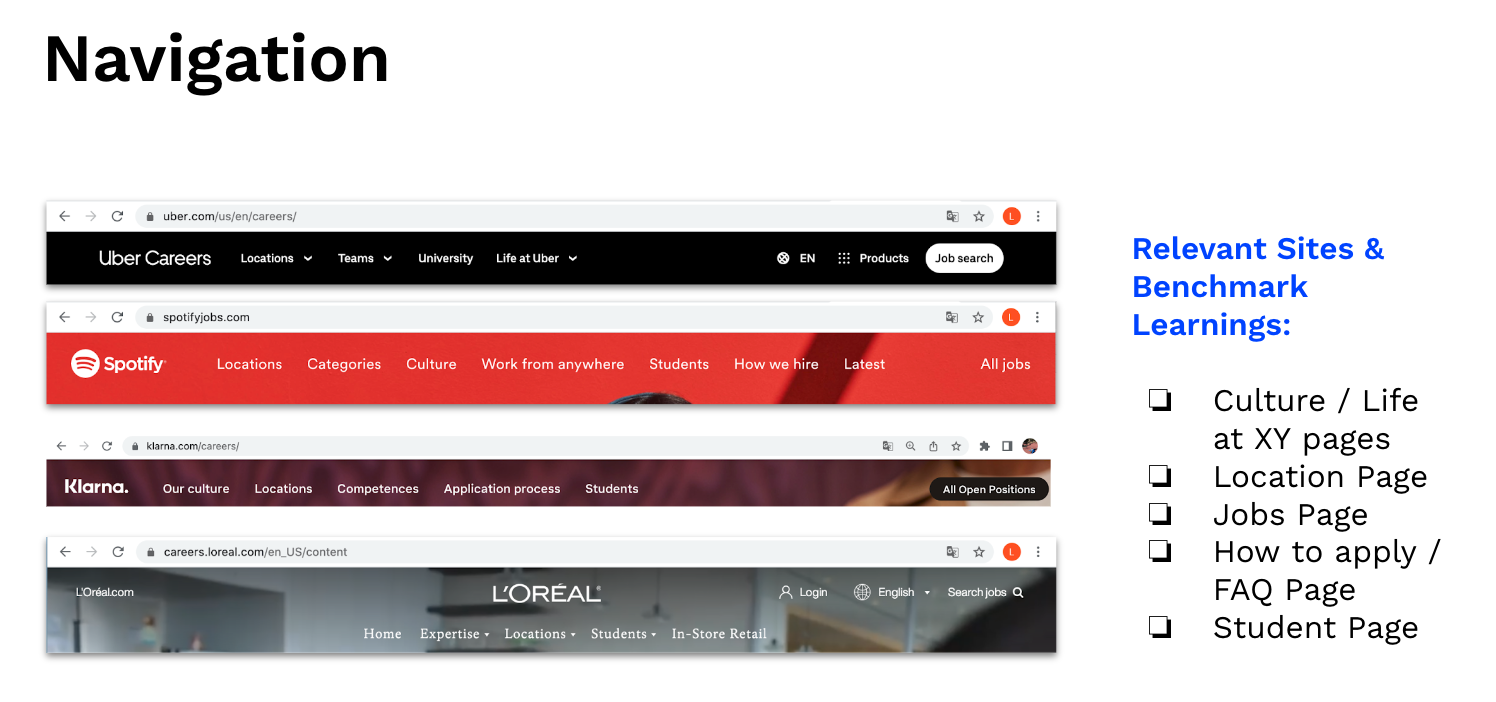
Navigation research & analysis
Quick Job Search & Filters
"All Jobs" button is evergreen for in-depth job search process
The "All Jobs" button is always evergreen in different pages as a main/core feature of the website menu navigation.
The "All Jobs" button is always on top right position in every page
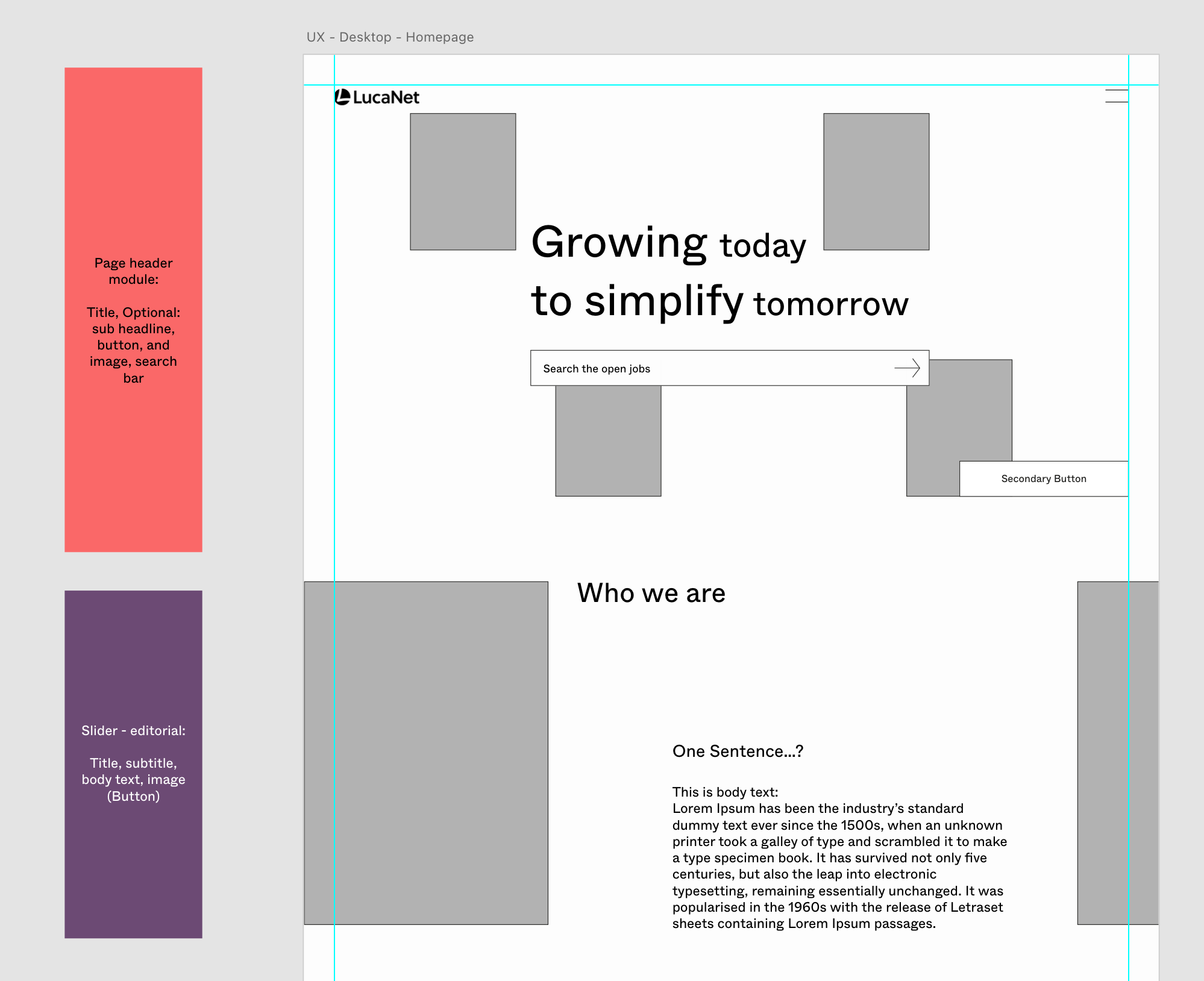
Homepage firstly serves the job search-bar feature
When the users first enter the page, they will see the company's motto and job search bar where they can search with job keywords including Job title, Job description, Locations such as city, country, even remote, competence, and levels of experience. With the fully functional home search bar, users can quickly search for their desired jobs right away.
Job search functions in homepage
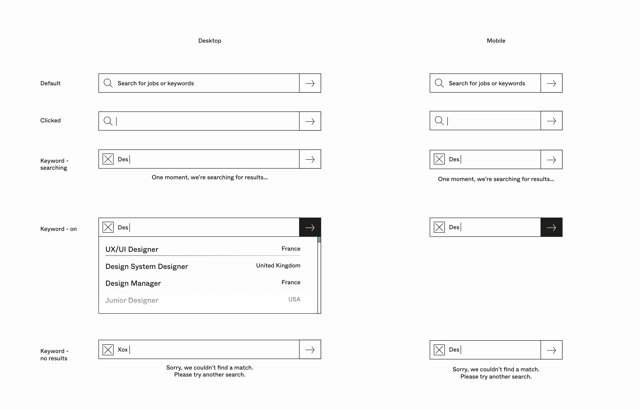
Job search flows and states on the homepage, with micro interaction for search lists loading, and if there is no result.
In-depth job search page has category filter features
For the in-depth job search process, searching with the same keywords as homepage is there, but also the results can be filtered with set categories such as - locations, experience, and competence. Multiple selection is possible. Thinking about different states, user experiences was a fun challenge.
Job filter functions in All Jobs page (Desktop)
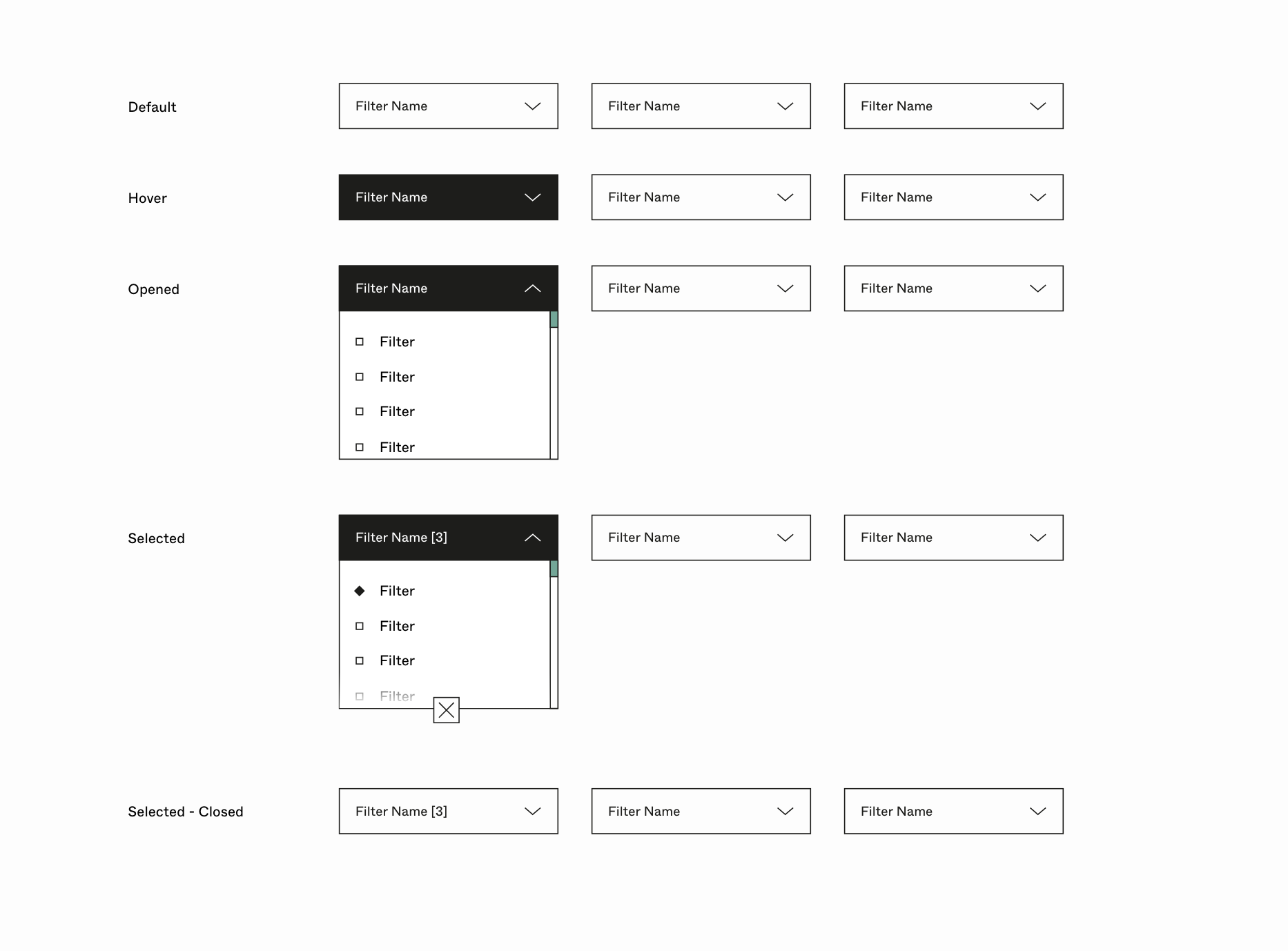
Job filter functions flow in All Jobs page (Desktop)
Job filter functions in All Jobs page (Mobile)
Found the Job?
Apply Whenever
After searching/filtering/clicking the job, the job detail page will have all infos regarding the job. The fixed interactive banner for job title, apply, share functions will be there for certain scrolling behaviour.
Job detail page and application banner responding to users' scroll
Storytelling
Authentic interviews & video clips
The website delivers real emotional employees' stories through their actual interviews and filmed clips across the world. The potential applicants will get to know the employer step by step. The brand stories, benefits, and tonalities will come little by little which makes it authentic, tangible, and human.
Employees' stories using interactive slider
Accepting cookies and Video snippets of employees brought from Vimeo
Gradual information delivery
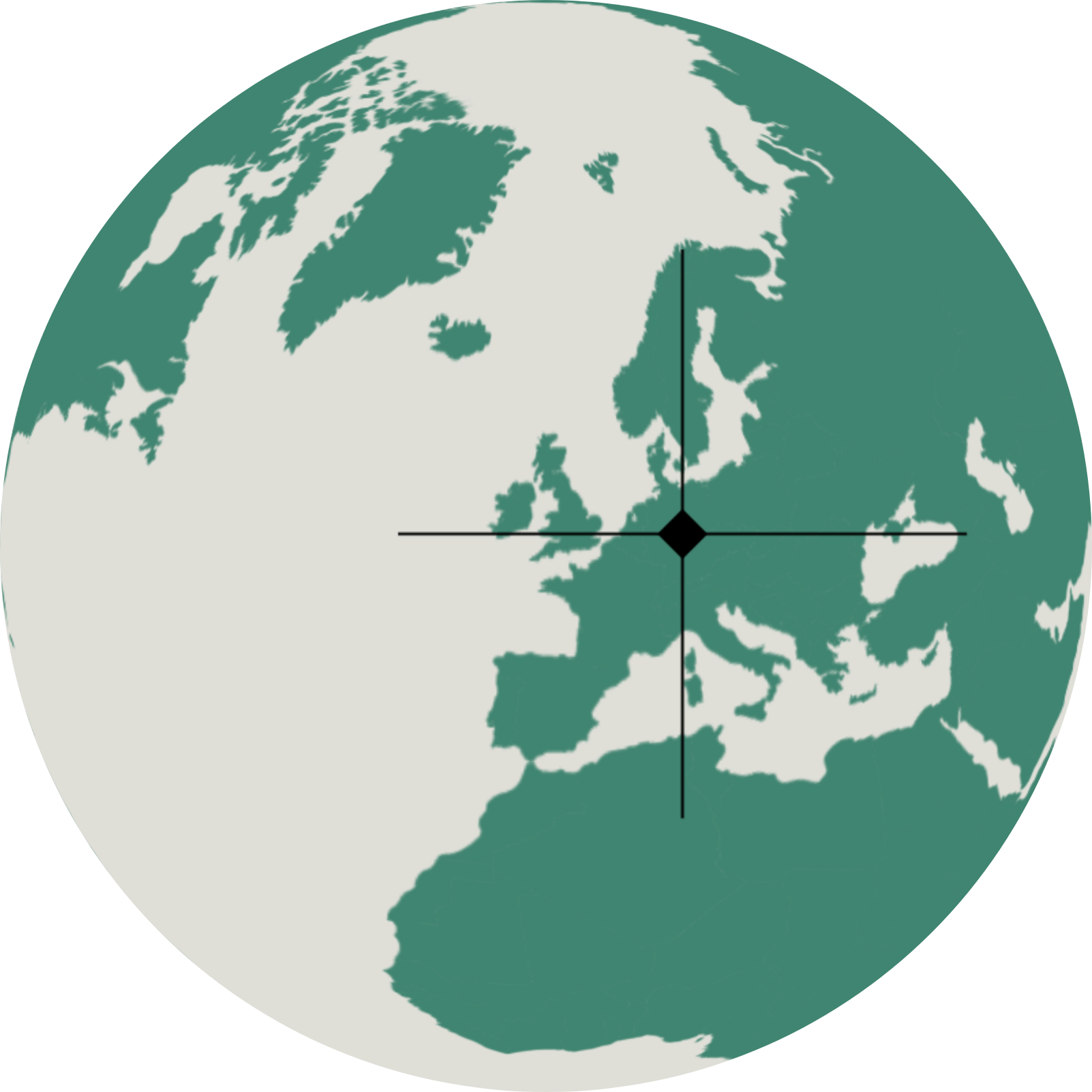
The 3d Map module shows the corporate's office worldwide at a glance. By users' scroll, the map rotates, indicating the offices in different countries. This interactive module is also editable in the backend so that editors can input location with relative description and that will show in the frontend.
Office Locations and their unique stories
Website Structure
For better user experience, storytelling and experiences were built first as wireframes. We sat 6 different pages with "All Jobs page" where users can search in-depth jobs. By this, users will absorb the information step by step, and access content quickly and efficiently. They will not face duplicated content or feel lost link after link.
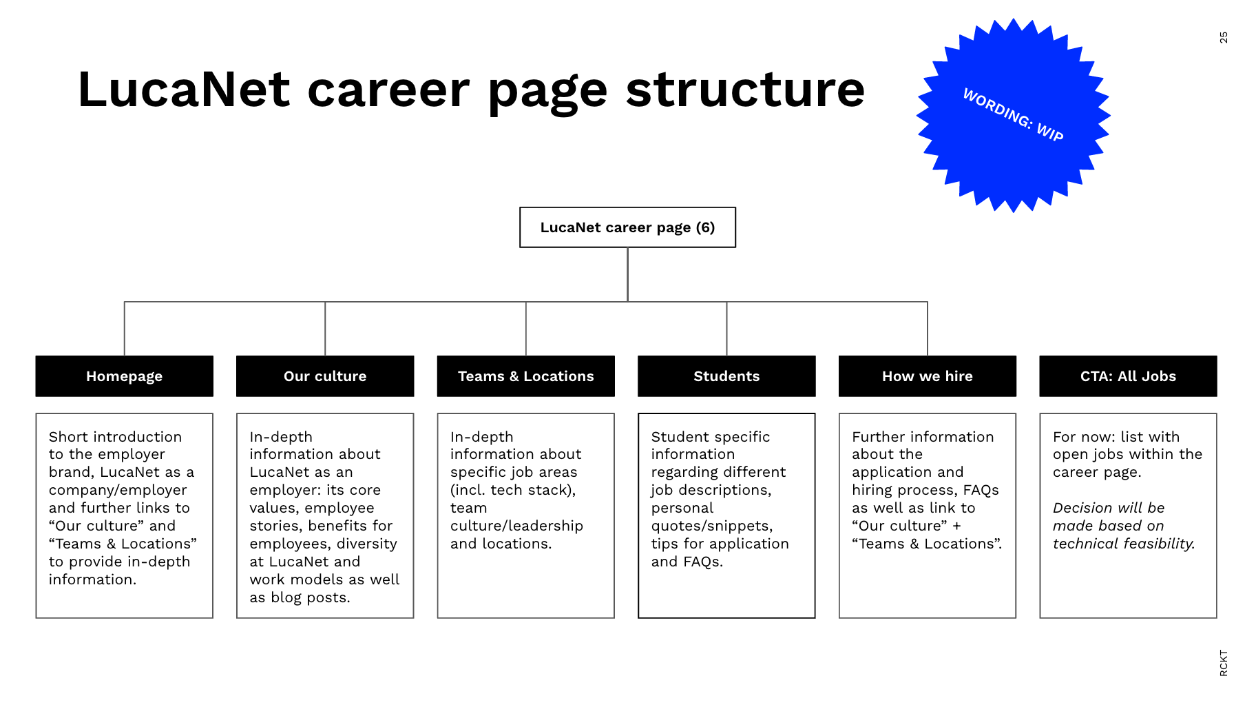
Sitemap structure - Big menus, and the "All Jobs page"
New Lucanet menu design
Modular Design
Modules with purpose: cost and time efficient
Based on the information structure and potential contents, the website structure became very clear. To boost efficiency, I decided to make a list of modules (13) with their purpose. Aligning with the UX writer, we managed to build a very efficient modular page structure that looks different from the page but still uses the same 13 modules.
This boosted a lot of efficiencies that both designers, writers, and developers were all happy about. Later also very easy to track down the cost/time/development estimation.
Since the module is designed thoroughly including text limits and images - the editor can add new content to the career website itself in the future without breaking the frontend. A few but versatile modules make this possible and give Lucanet the greatest freedom.
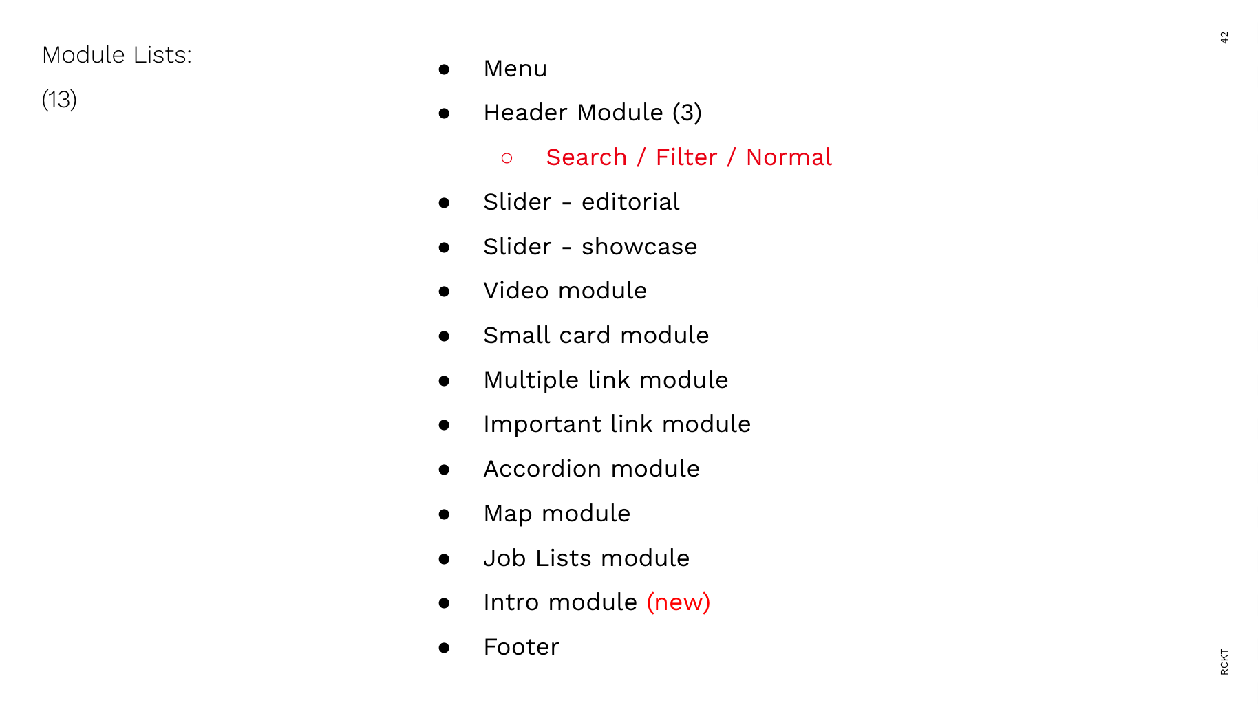
Lists of modules
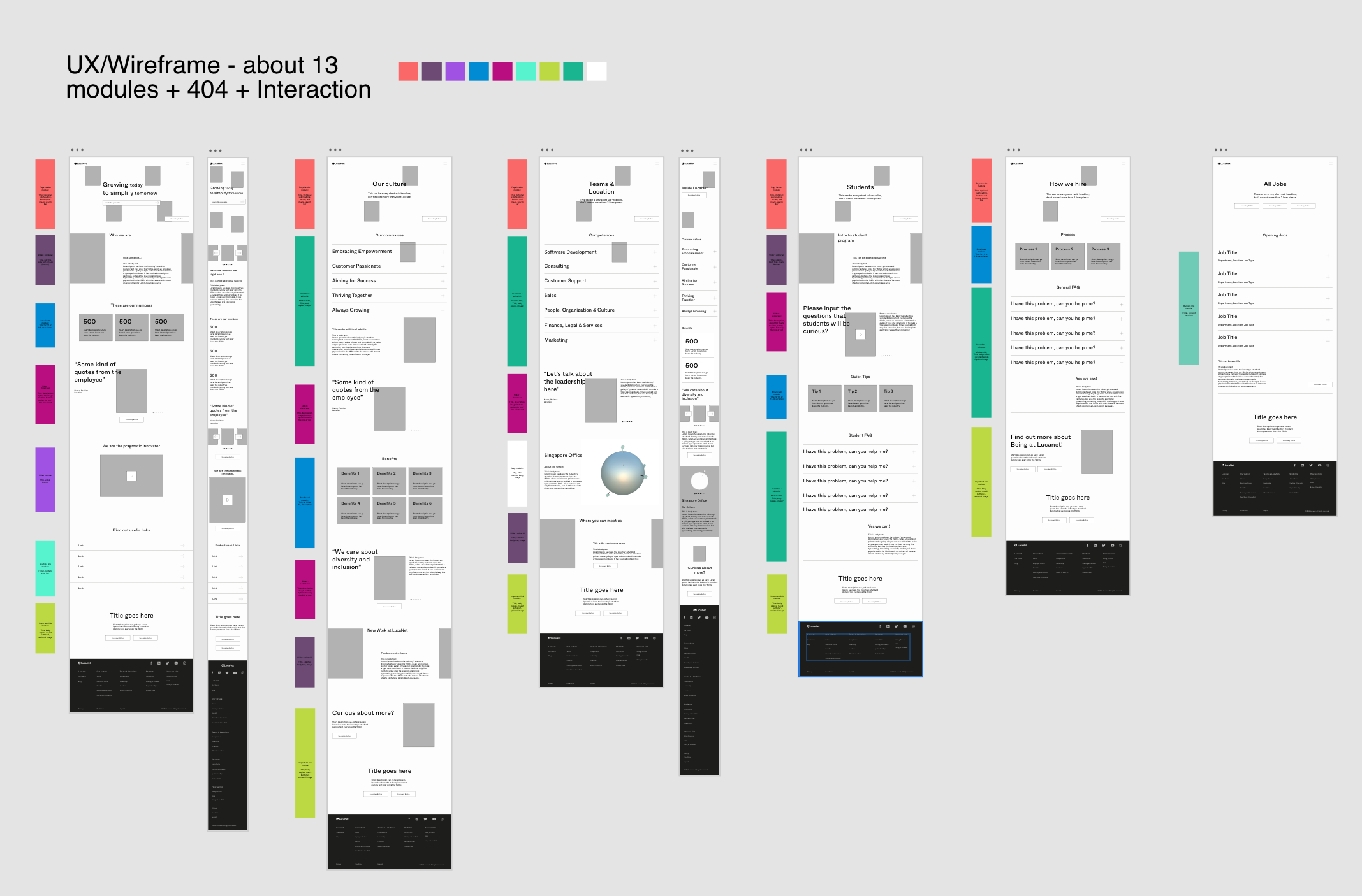
How the web pages are built using 13 modules
CMS considered content input already thought out wireframe process
Modules' UI design varies pending on the CMS input
For the sake of efficiency, I designed that a single module can perform multiple different variables pending on already set CMS input selection. For example, this "Important link" module will have variables like:
1. Background color
2. With or without graphic line elements
3. With or without Images
4. 1 or 2 CTA options
All these variations are actually from one module
New Lucanet Scalable System
Sustainable not for one time usage
The design system was built from atomic design methodology. It starts with single buttons, Icons and then input fields, search, categories input, and more. This shows the ambition towards systematic design that can be applied not only to the career website but also the bigger picture: their main corporate website.

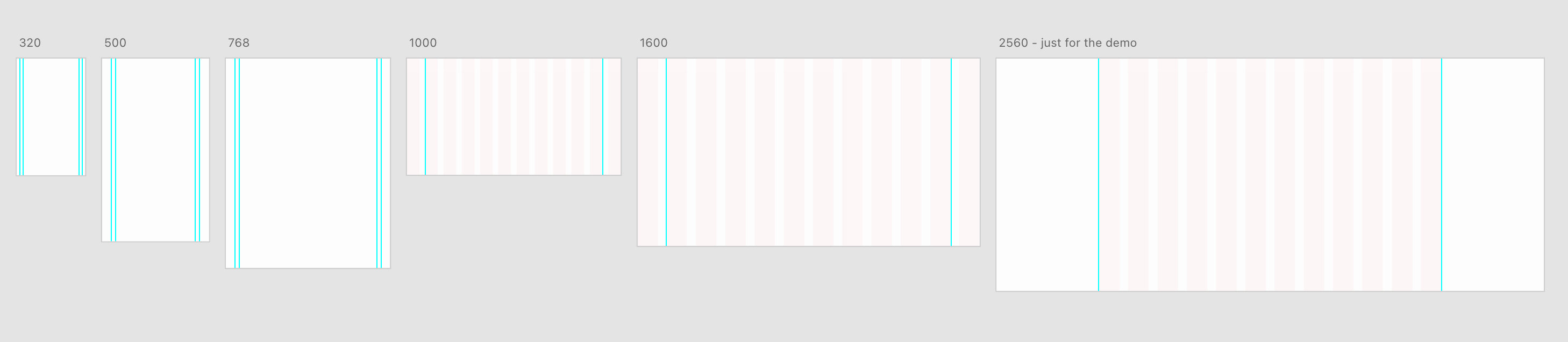
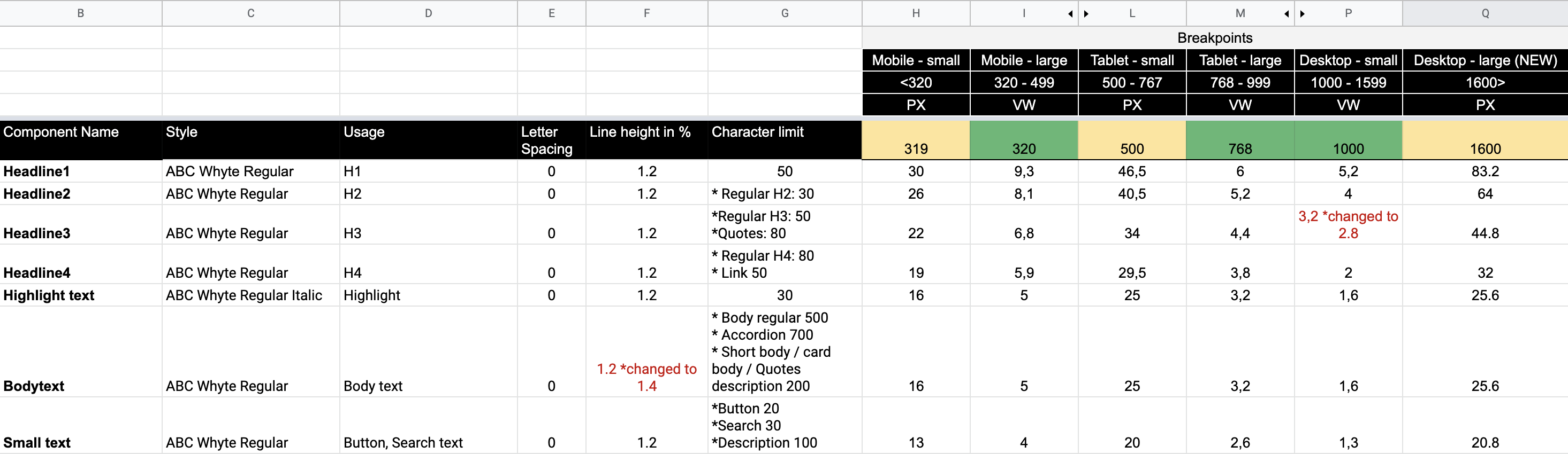
Breakpoints
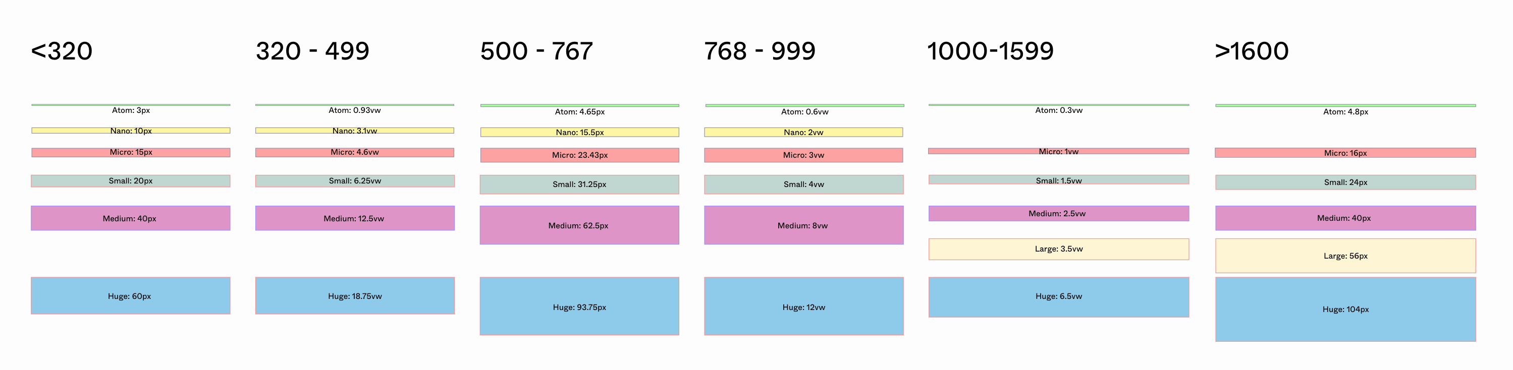
There are five breakpoints, on the desktop having 12 columns. The website uses fixed and fluid systems across the system. That is, within "fixed" the measure units are PX, while in "fluid" the measure units are VW. This applies margins, paddings, typography, image sizes, and line thicknesses.
Spacing
Shows different sizing units following breakpoints + fluid and fixed breakpoint system.
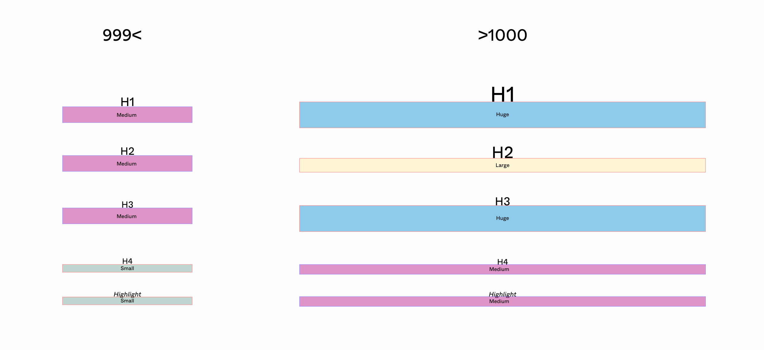
Typography
7 typography styles are holding different functions. I communicated the character limits with the UX writer also applies to typography style and that way the content is aligned and set the text limit in the backend: usually editors put too many texts and that breaks the module and design. But this way, this is solved.
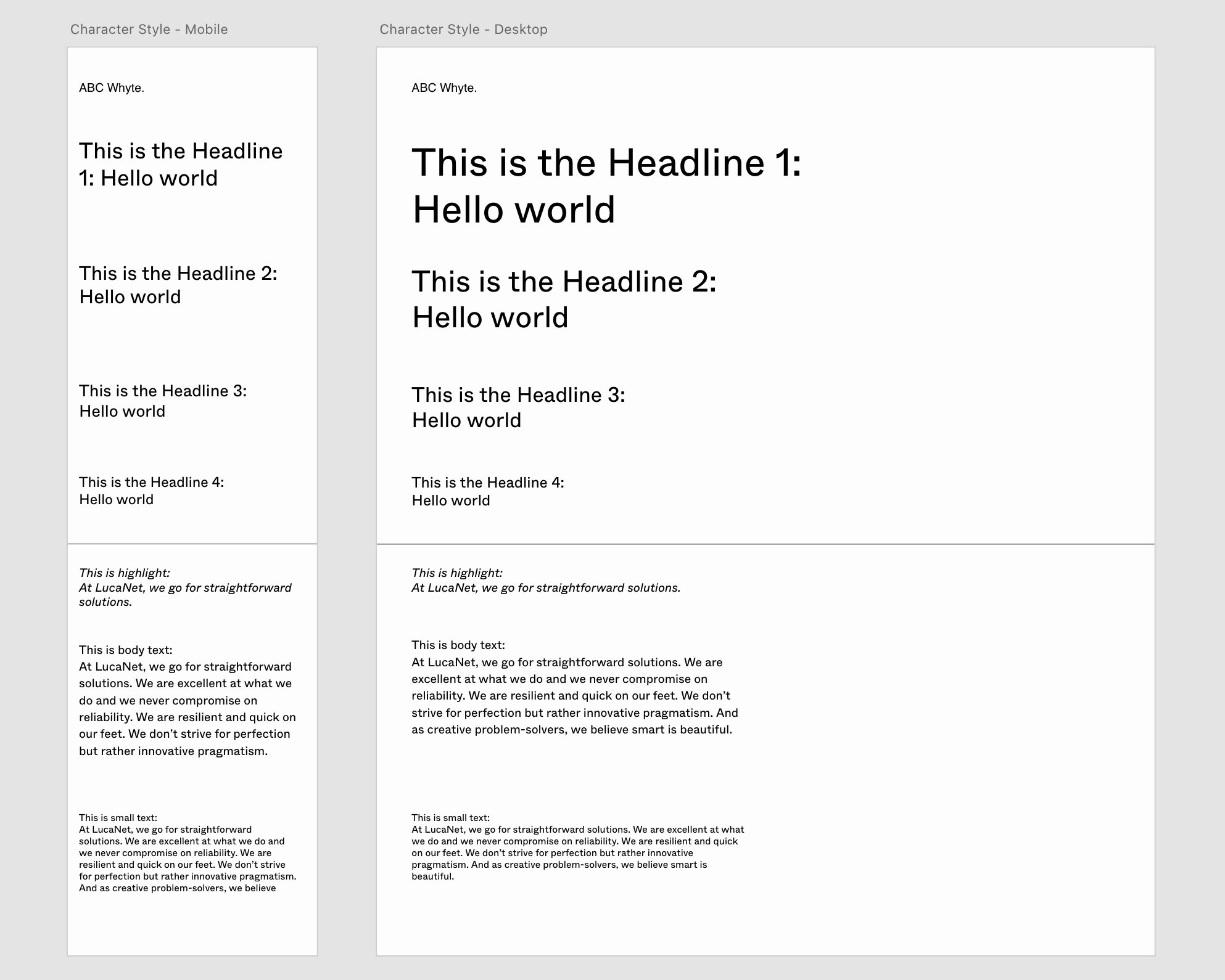
Typography Spacing
For each typography style, designated bottom-margin is set to prevent inconsistent margins, therefore keeping the hierarchy of the typography nice and neat.
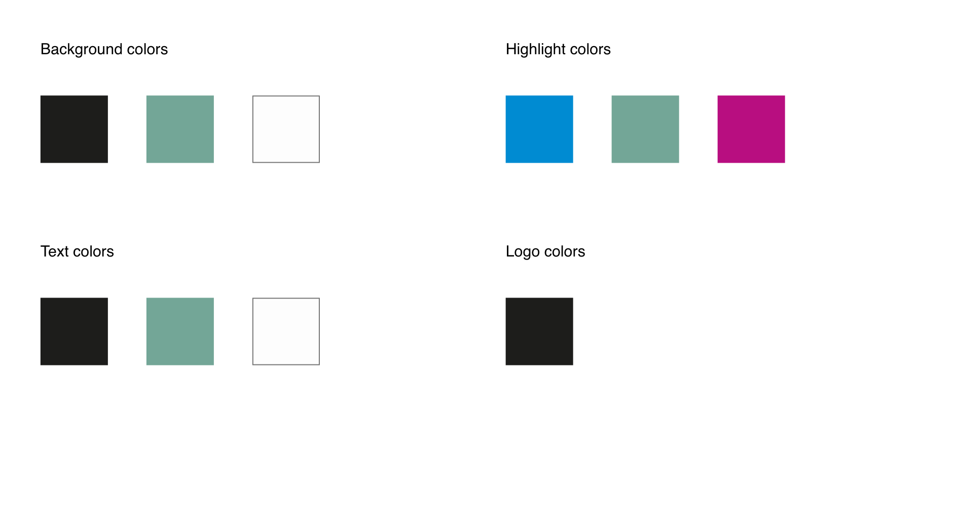
Colors
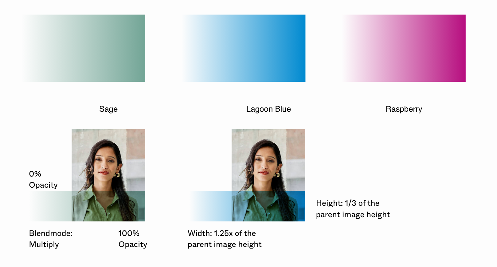
The colors are adapted for the digital version of Lucanet's new branding. The highlight colors are only set for photo application to give a visual accent. Nevertheless, the interface colors are only set as three colors: black, sage, and white to make it consistent, modern, and clean.
Color applications on Images
Three highlight colors are used for photos. The application is set as frontend code, so despite the editors (mostly the client) upload or edit any photo, the website interface will always look consistent.
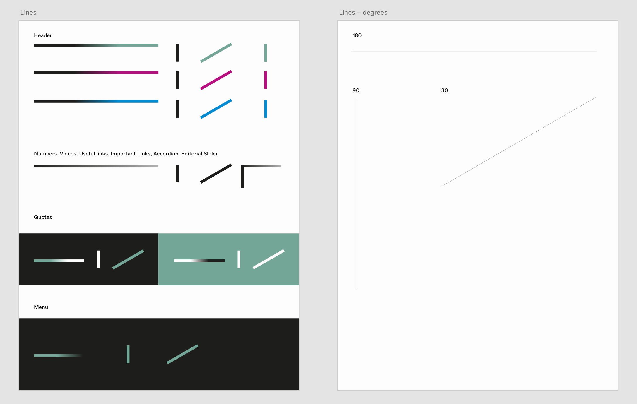
Color applications for line details
The line colors and angles are also assigned per module.
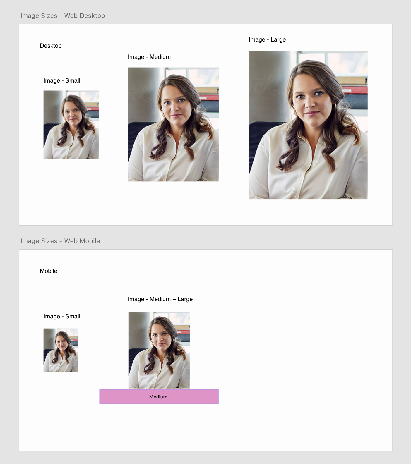
Image
Images sizes are having two different sets - desktop 3 sets pending on sizes and mobile 2 sizes. And responsiveness act differently pending on the breakpoints.
UI Design/Atoms/Molecules/Layout
Search bar, card, accordion, tag, indicator, buttons, etc are all considered with different hover states pending on different background colors. Button hierarchy such as primary and secondary was also considered.
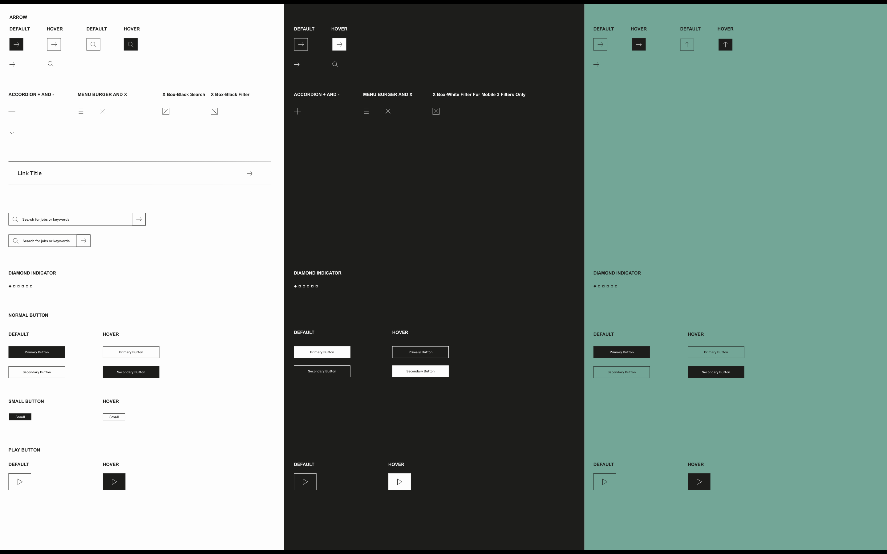
Buttons on 3 different background colors with primary, secondary and functional buttons
Motion Interaction
The lines are animated by the scroll and expanding, means thriving and evolving team culture of Lucanet. Following that "thriving" concept, the button interaction also has pusing up hover effects.
How lines are expanding
Buttons interaction
Unified Interaction Details
I believe small design details accumulate and elevate the product to the next level. Therefore especially for the web app experience, I took extra care for the mouse hover experience.
Unified link interaction between 3 different modules
Efficient Sprints
Dev Communication
First the system, Epic by 13 modules, and details within
To the 100% clear delivery, I first made Jira epics including "Design system" and existing 13 modules, that becomes 14 epcis.
Design system epics explains general page structures and how this will influence other 13 modules.
Then within 13 modules, I made frontend, backend, Interaction - landing / Interaction - States / and more tickets for clear arrangement and communications.
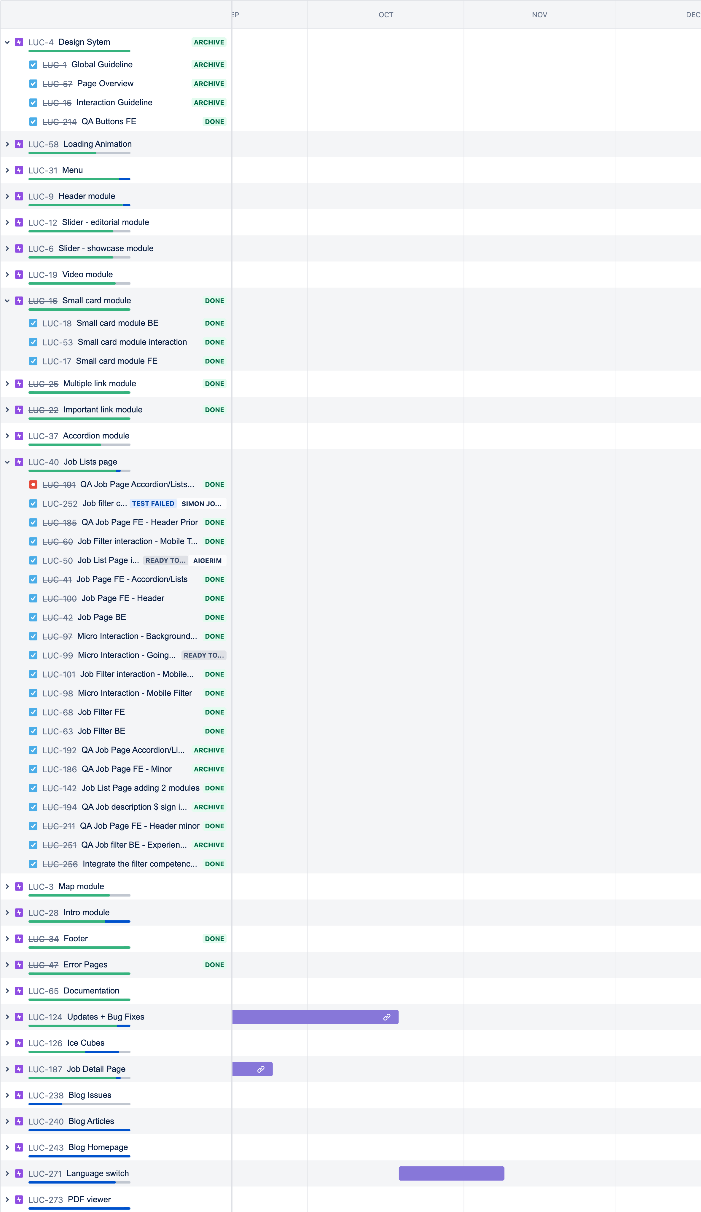
Processes on Jira, epic by Modules and FE,BE, Interaction and QA tickets are all included for each
25 epics, 175 tickets issued and done!
In the end, during the process, the epics and tickets are doubled but together we managed to achieve a highly interactive, useful, and beautiful web app. Although I tried to make it clear as possible, communications can sometimes be tricky and I believe that is because we all have it on other daily bases. However, the developers were very impressed and happy to work on it. At first, setting up the system was tricky, but the process was getting faster and faster later.
I learned a lesson that, constant talking, and never giving up communication was the key to achieving a beautiful product.
Impact
The initial plan
Initially, I was about to take three parameters to measure key metrics for the project’s success.
1. Increased number of applicants
2. Increased average time by page
3. Decreased bounce rate
Unfortunately, the no1. parameter, the number of applicants could not be grasped, as I changed my job right after the end of the project. Nevertheless, at the end of the project, I captured data from google analytics.
The outcome
We compared the time between before our first website launch and after the launch. The outcomes are
1. The pageviews increased by 1.3 times
2. The average time one page increased by 3.4 times
3. However, the bounce rate increased by 2.3 times
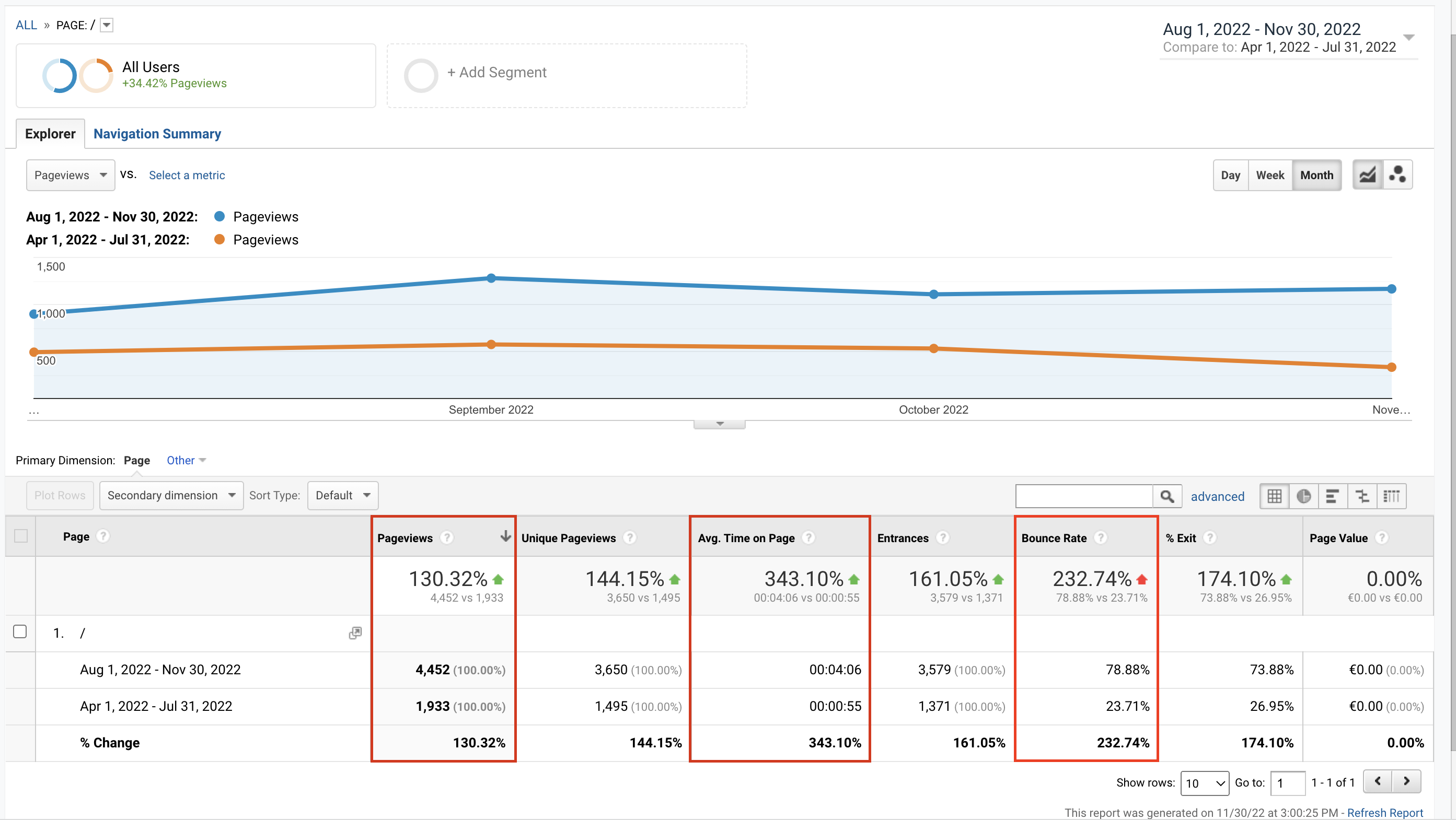
Screenshot of Google analytic
Retrospective
I wish I had more time and worked with a pro analyst to fix this further. But since it was a project in the agency, it was also quite a challenge to take a look at the product and iterate like product companies. But still, I am very happy and grateful that I could achieve this amount of work and shipment in a limited time and budget. I appreciate all the people who were involved in this project to make this happen.
Thank you!